
Analytics are the metrics and measures that tell you how people are interacting with the content you produce. Google Analytics is offered for free, and you can install it easily into your website (if you don’t have it already). As a marketer, Analytics give me LIFE! I love the fact that you can easily track progress and measure the success of your efforts in real time.
Looking at metrics not only informs you who is looking at your content, but how they are, and what else they might be interested in. It allows you to make major decisions, and can inform you of small tweaks you might want to make during the middle of a campaign.
If you don’t have Google Analytics already installed on your site, be sure to check out how to easily get it, right here from Google.
Before I dive into my four favorite reports to look at often, there are a couple of insights I’d like to share…
Use the date range feature of the report to get exactly what you want. It defaults to a single week, but I recommend looking at months, quarters, and years.

Be sure to look at your analytics consistently. While you might be able to get some helpful data by looking at a single chunk of time (like a single month or a single year), the real magic happens when you compare.
I recommend doing a monthly report, a yearly report, and reports that compare months from each year (i.e. March 2018 to March 2019), and year over year reports. That way, you can truly see what is working and what isn’t. It will also give you the all-too-important information about seasonality and trends.
Be sure to keep a timeline of important events that happen within your company that you can look at to help inform the metrics you’re analyzing. Did you create a new website in February? Did you run out of your most popular product and have it on back order for a few weeks in May?
Keep a spreadsheet that you can reference to help you understand the dips and peaks you’ll find in your analytics.
Resources
Google offers a ton of great resources for free education. Even though I’ve been using Google Analytics since 2012, I recently completed Google Analytics for Beginners in the Google Analytics Academy, and I have to say I still learned a lot! There is always something new you can learn about using this powerful tool. (They even give you a neat certificate at the end!)
So, without further ado, here are…
My Four Favorite Google Analytics Reports to Look at Monthly
Audience Overview

This report tells you: the languages your audience uses, the percent of new vs. returning visitors, how many pages per session your audience is viewing, and the bounce rate (when a person comes to your site but doesn’t interact and leaves right away). The overview has even more to it, but those are the metrics it has that I most closely examine. Why I love it: you can act on each of those metrics. If you have a significant portion of your audience that speaks a language you don’t feature, invest in a translator for your most viewed pages. If you are finding that you’re not getting enough new customers, run an acquisition campaign. If your goal is to lead your customers to complete a transaction but they’re only viewing one page, dive deeper and figure out where they are exiting (there’s a report for that)! And if you’re experiencing a higher than average bounce rate, you can work to diagnose the problem. These metrics are so important that I will often look at them more than once a month.
Acquisition Overview
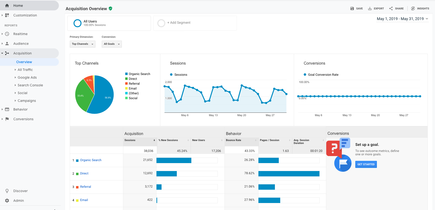
This report tells you: Where your audience is coming from – websites, social media sources, emails, paid advertising, direct traffic…etc.. Why I love it: You can really explore what sources are working best for you. It tells you where to continue to invest your efforts, and what platforms or resources might need a new approach. For instance, if Pinterest is only giving you a few viewers a month but you’re spending an hour every day on it, then it might be time to drop that platform. Or, if you’re sending a single email each month but it’s driving a large amount of traffic to your site, you might want to try increase to two emails. It’s a great way to find the opportunities that you might not know existed. If you compare month to month and are seeing an increase in traffic from Instagram, you know you should spend more time optimizing that platform so you get the most bang for your buck.
Audience Interests Overview

This report tells you: a general overview of the additional interests of those who visit your site. Why I love it: it can give you great knowledge about what else your audience is interested in! Knowing what they like, care about, and interact with can help you decide who to partner with, how to frame your ads, who you might want to run a giveaway with, and what other products or services you might want to offer. It helps you decide how and where to spend your advertising and marketing dollars!
Custom Reports: Day of the Week and Hour of the Day
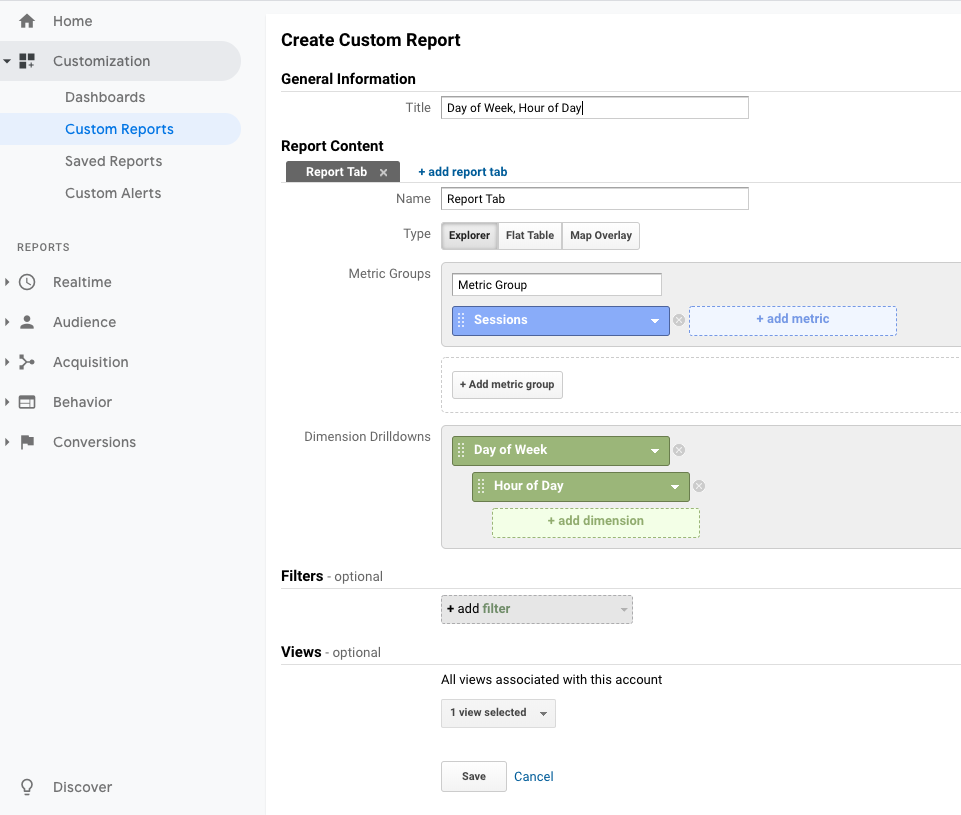
article I found from Hallam: Google Analytics: hour of day & day of week reports.
These reports tell you: what day of the week people are looking at your site, and what time of day they are looking at your site. These are two custom reports that you can easily create. Why I love them: again, these reports are very actionable. If you know what your most popular days are, then you can know when you should be open. If you know what time of day people are interacting with your site, you can know when you should have customer service and chat staff available, and when you should post new content. You can see how these reports change with the seasons and with events and holidays.

Bonus reports:
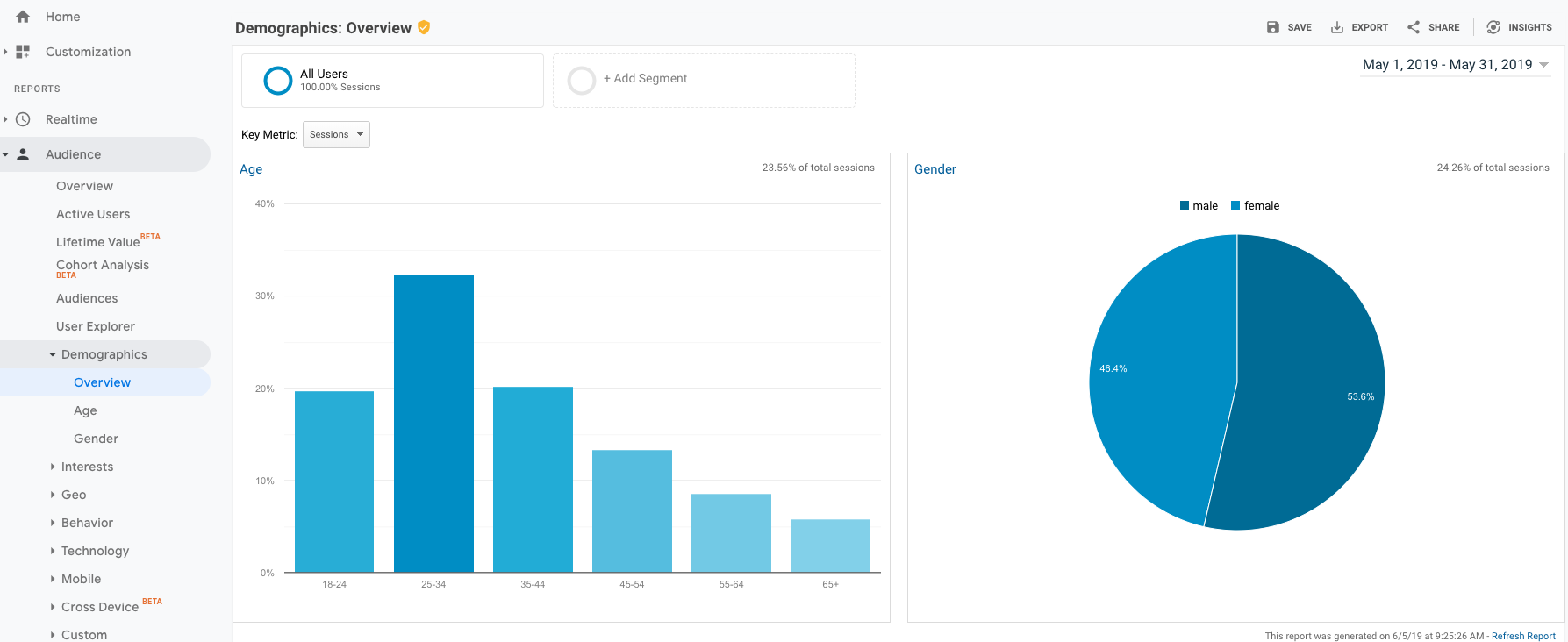
Audience Demographics Overview. This report details the age and gender of your audience. I like to look at this once in a while. I find it doesn’t often change unless you run a promotion to acquire a new demographic, but it can still be very insightful. Usually I’ll check this about once a quarter if I haven’t done any major acquisition campaigns.

Audience Mobile Overview. This report tells you what device people are using to interact with your site. For most companies and organizations, that will be on mobile devices such as cell phones and tablets. For some select industries, desktop still rules. Regardless of what is the most popular for your organization, I guarantee you that a significantly large enough proportion of your audience is on mobile devices, so be sure to optimize your site for mobile. What does that mean? You want to be sure the images you use can load easily (aren’t too large of files), and that your content reacts appropriately when shrunken down. If your site doesn’t change in appearance when you shrink your window to mimic a cell phone, you need to update your coding, fast.

Realtime Overview. This report tells you what is currently happening on your site in…you guessed…realtime! You can watch the pages people are looking at, what devices they are on, how long they’ve been there, and what country they’re accessing your site from. It can be very helpful to check this during a product launch, outage, event, or during certain times of day that your’e curious about what your customers are interested in.
So that’s it! Those are my favorite Google Analytics Reports.
Let me know in the comments if you have used Google Analytics and what your experience was with it!
Thank you for reading, I hope you enjoyed!

Great post thank you. On the subject of learning if anyone is subscribed to it Linked In learning also has some detailed courses on Google Analytics. I used it and don’t have any real complaints but I don’t push it that hard 🤗 Thanks for the read. Stacey
LikeLike
Thank you Stacey, I’m glad you liked it! I adore LinkedIn Learning! I currently work at a University where it’s offered to students, staff, and faculty for free so we get to explore all kinds of topics that interest us. There are some great programs in there! Right now I’m taking it to learn about Adobe InDesign. I haven’t taken their Google Analytics course, but I’ll take a look at it, too!
LikeLike